Contextualizing metrics with contribution

I’ve previously written about dimensional richness being one of the most important elements for organizations to incorporate data in their decision-making processes. Rich, actionable dimensions are essential to efficiently locating the most important movement in a metric.
There’s another equally powerful concept that high-quality dimensions unlock for organizations called contribution, which quantifies the impact of any one dimension value on the aggregate metric. Contribution uncovers previously hidden trends and opportunities that can go easily undetected when just looking at the raw values themselves.
What is contribution?
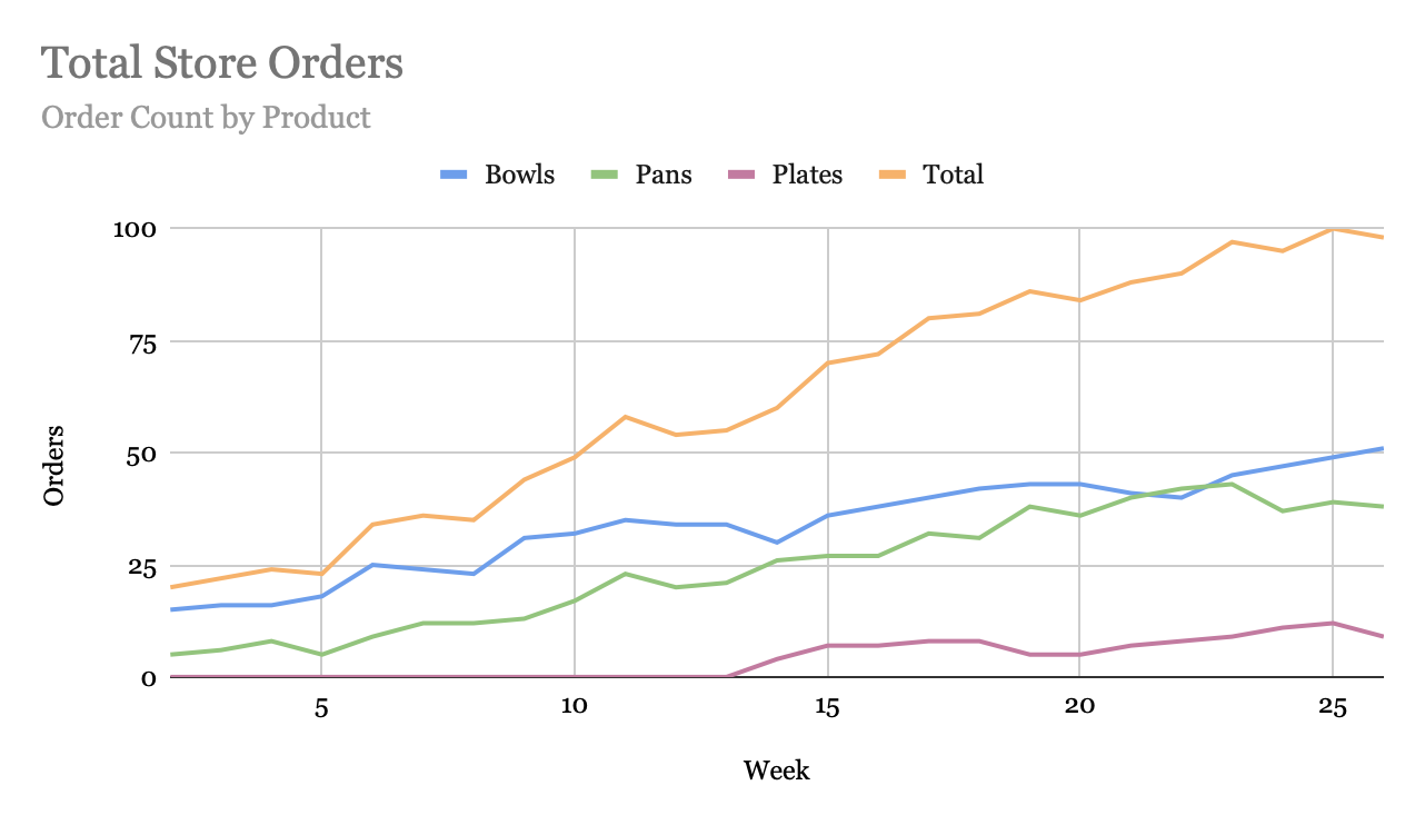
To illustrate this concept, we’ll start with an example. Let’s say that I run a store that sells three products: plates, bowls, and pans. As the store owner, I might track weekly orders as a key metric, and so a simple dimension I have for sales would be product type.
In this case, if I’m looking at orders by product type, I will see it broken down by three dimension values — orders for plates, orders for bowls, and orders for pans. While the absolute value of orders is important, it’s just as important to understand what the relative share of each product is to my overall order count. For instance, if I have 100 orders this week, with 10 plates, 50 bowls and 40 pans, I should be interested in knowing that I sold 50 bowls AND that bowls represented 50% of my orders.
The relative share of a metric’s value that a single dimension represents is what we call contribution. By tracking a certain dimension’s contribution to the aggregate metric over time, we get a sense for how its relative importance evolves, which provides an important layer of nuance in subsequent discussion and decision making.
How can I use contribution in decision making?
Contribution contextualizes the impact of the various values along a given dimension on the overall metric. In many cases, contribution highlights when a single segment of a metric is over- or under-performing the broader measure, which might otherwise be missed by just looking at the change in value for the metric.
Returning to our shop example, let’s say that orders have been steadily growing over the past 6 months, such that 6 months ago we were only doing 20 orders per week, of which 0 were plates (we weren’t selling them yet), 15 were bowls, and 5 were pans. As we grew over the intervening months, the raw order counts for plates, bowls, and pans all increased. If we’re not looking closely, we’ll see that everything is up and celebrate our success!
However, when we glance at the contribution chart, we see something very interesting that would have otherwise been missed — the share of orders for bowls has been steadily declining, from 75% at the beginning of the period to 50% at the end. This gives us a very tangible observation to debate now — why has the order pace for bowls been lagging the rest of our orders as we’ve been growing? Has something changed in our pricing, customer profile, marketing, or even store layout that might be making people less likely to purchase bowls, despite the fact that there are people buying more products in general?
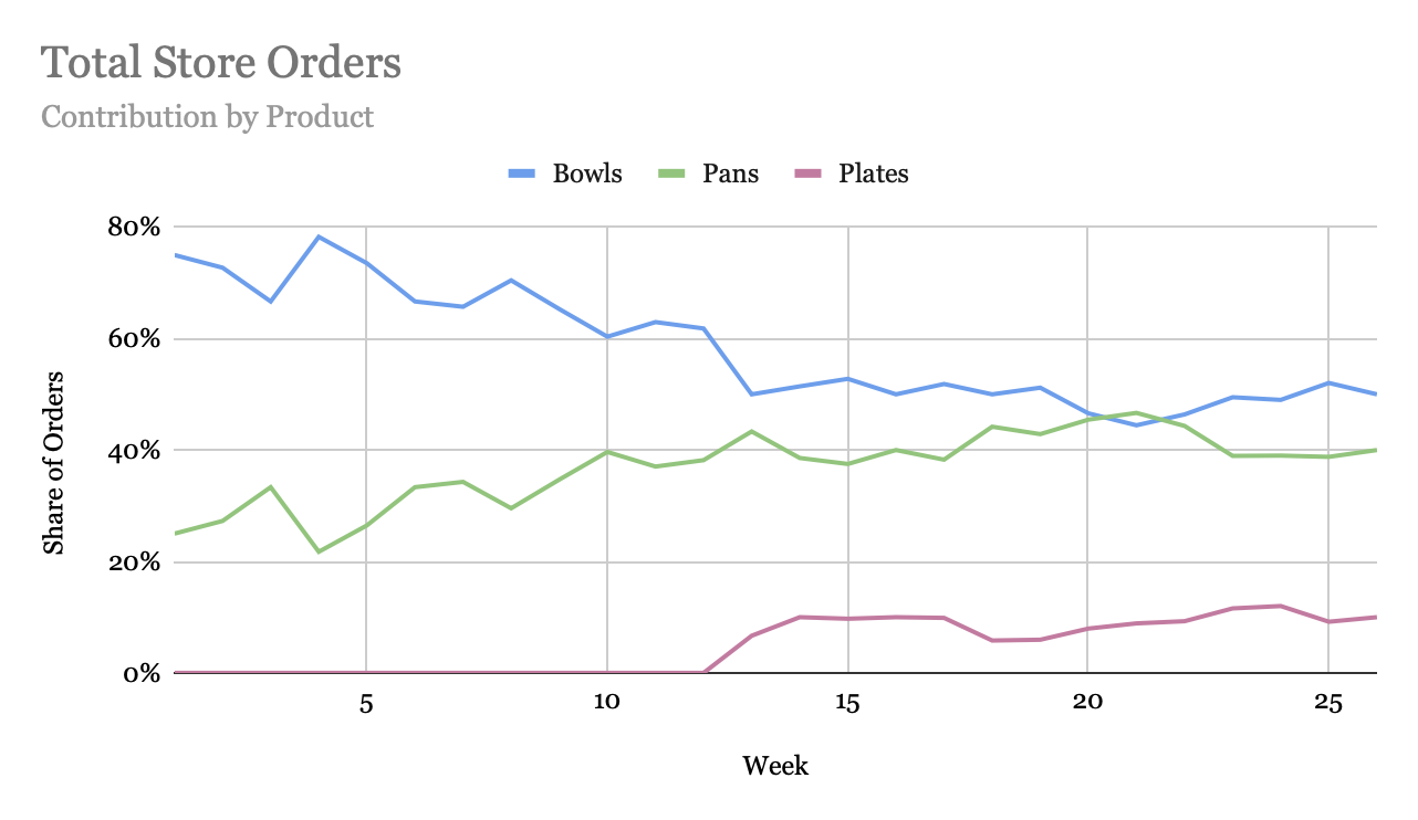 Whereas in the world without contribution, just looking at the upward slanting line chart seems to tell us that all is well, when we add this extra layer, we’re effectively zooming in on the hidden movements going on below the surface of our metric. This simple restatement of the metric allows us to identify and investigate driving and detracting cuts of the measure so that we can ensure we’re not missing out on opportunities or unaware of an impending crisis.
The concept of contribution can be applied to essentially any type of metric that is sliced by a dimension — it is always simply the total share of the metric data points represented by that dimension value or set of dimension values. Thus, it should be seen as an essential component in every team’s toolkit for contextualizing the health of their metrics, regardless of what it is that is being measured.
How can I incorporate contribution into my workflow?
While computing contribution is relatively straightforward (just keep track of the relative share of data points that dimension values represent of the whole), representing can be a bit of a challenge since you’re now effectively doubling the number of values to keep an eye on. While platforms like Falkon are built to help automate your ability to analyze all these possible representations and focus on the most noteworthy changes, even without such tools, you can borrow from best practices of high-performing analytics teams:
- Visualize contribution alongside raw values. This can be done with a 100% stacked bar or area chart, or with a line chart for contribution of each value as shown above — while the stacked bar/area view shows the total metric change and highlight larger trends, the line charts tend to make shifts in individual cuts more apparent. When sliced by an actionable dimension, having this additional visual clearly indicates which dimension values are driving or detracting from the parent metric.
- Include changes in contribution in your reporting. Just as rich dimensions allow you to describe what segments of a metric are powering the growth or decline, listing out the largest contribution changes is an important way to understand when the composition of any metric is shifting
- Summarize the contribution shifts into a single value per dimension. Summarizing all the contribution changes for a single dimension helps quantify the underlying noise in that slice. In general, we would expect contribution to be relative stable in the near term — and so tracking the amount of change between reporting periods sheds light on the underlying stability of that metric. Average absolute change, average squared change, and variance can all be used to quantify this.
- Track trends on contribution just as you do on metric values. Trends tell us the long-running behavior of metric values over time. Given that contribution can be just as insightful as the value itself, tracking trends over specific dimension value contributions over time keep visibility on longer shifts in the importance of specific values to the overall metric.
Bringing contribution to the forefront of your metric awareness empowers your team and stakeholders to contextualize the data in front of them in new ways, up-leveling the conversations around what opportunities are being missed, risks are developing, and what trends should be capitalized upon. By adopting these measuring into your workflow, you’ll rapidly see tangible benefits through focused conversations on the most important trends underlying your key metrics.