How averages go awry

Does your team use averages for your critical metrics? Have you found yourself frustrated by their inability to convey actionable insight or guide important decisions? If so — and I think almost every team has at least one average in their KPI list — this problem may be because your averages are hiding critical undercurrents in your data.
In my previous post, I discussed the importance of building rich, actionable dimensions to help focus organizations’ attention on the most important movement within their metrics. In this article, I’ll address a related challenge around extracting meaningful insight using metrics defined from distributional data.
What is distributional data?
As a simple example, I could define a distribution as: Time to first transaction (action) for new customers (entity) each week (time frame). For a given week, I would now expect to have a list of customer IDs and individual transaction times for those completed in the prior week. This would effectively be a giant table like below, which are commonly summarized into one of my favorite visualizations: the histogram.
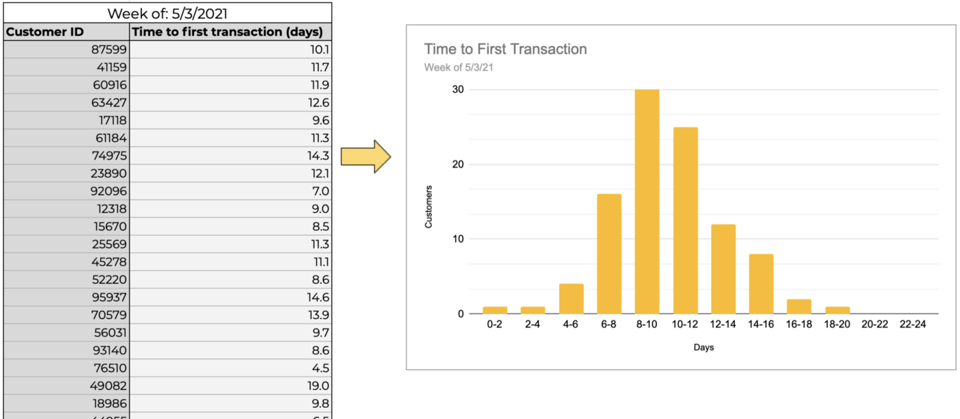
As a quick refresher, histograms show the count of members in the distribution whose values fall into the respective ranges, or “bins.” So in the above image, out of the 100 customers in our example distribution, thirty took 8 to 10 days for their first transaction, nine took 14 to 16 days, and so on.
More generally, distributional data can defined by three elements:
- The entity being measured. Examples include transactions, customers, accounts, or sessions, to name a few.
- The action being performed by the entity. This is what we are interested in measuring — purchase volume, time to first/next transaction, time to support ticket resolution, time to receive shipment, or items in cart.
- The time frame over which we collect data on the actions. This can be done in several different ways — a range of calendar days or weeks, a trailing window, or even all time. Note that cohorts are a special case of distributional data that many teams utilize, with somewhat unique time frame specifications. I won’t talk about them explicitly in this post though (perhaps in a subsequent one!).
What is a distribution metric?
Now, distributions can get complex rather quickly, and don’t lend themselves to quick and easy communication across teams. Thus, we need an approach for succinctly describing a distribution, which is where distribution metrics come in. The most common of these is the average, followed closely by the median, and occasionally an outlier tracker such as a p95 or p99. With a distribution metric, we can compress all the information contained within the distribution, which could number in the hundreds, thousands, or even millions of individual actions we are measuring, into a small handful of numbers that can be easily graphed or tracked in a spreadsheet.
While the simplicity of representation is great, in practice, for nearly all metrics that matter, we have cast off far too much information in our pursuit of simplicity. Just looking at these summary measures can prevent us from missing the smoldering embers in small sections of our distribution until they have grown into organization-wide infernos.
Potential pitfalls of the average
The reason for this is pretty straightforward — an average of a distribution is calculated by dividing the sum total of the measure of interest by the count of entities in the distribution. Thus there are theoretically infinite combinations of values that can lead to the same average, with widely varying insights or conclusions that one might draw based on the underlying distribution.
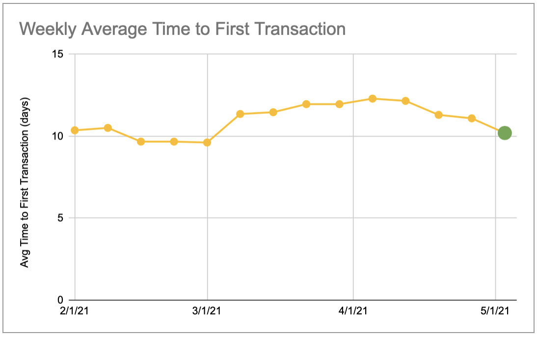
Going back to our previous example, let’s say that we’ve chosen to track average time to first transaction for new customers each week. Now during our weekly review, we observe that this metric has increased two percent from last week. This is roughly within bounds of our weekly fluctuations, so we pay no attention to it and carry on with the review.
However, let’s consider some of the different scenarios that may have led to this:
- There may have been truly random movement across the distribution, with most people transacting in about the same time, a few taking a bit less time, and slightly more customers taking a little longer before their first purchase — but overall, nothing of note. Since we have no other evidence to go off of in the moment, this is our assumed case.
- While a meaningful number of people actually transacted in slightly less time, a small segment of new customers from an affiliate source saw a huge jump in time to transact. Perhaps there was a campaign or promotion that drew in a lot of traffic but people were getting lost after landing on our site. We will completely miss this case, which could quickly become a big problem if we scale up the promotion because the face-value engagement numbers looked good.
- A change to the order flow had a positive improvement on app customers but was essentially cancelled out by a slight negative impact on the larger share of mobile web customers who ended up with a more confusing experience. We will not detect this subtle shift, and may draw the wrong conclusion about the changes either not having the desired impact or opting to wait for more data when we have all the information we need already, hiding in plain sight.
As you can see in the respective histograms below, despite the average being the same for each of these scenarios, the overall shape of the distribution is dramatically different.
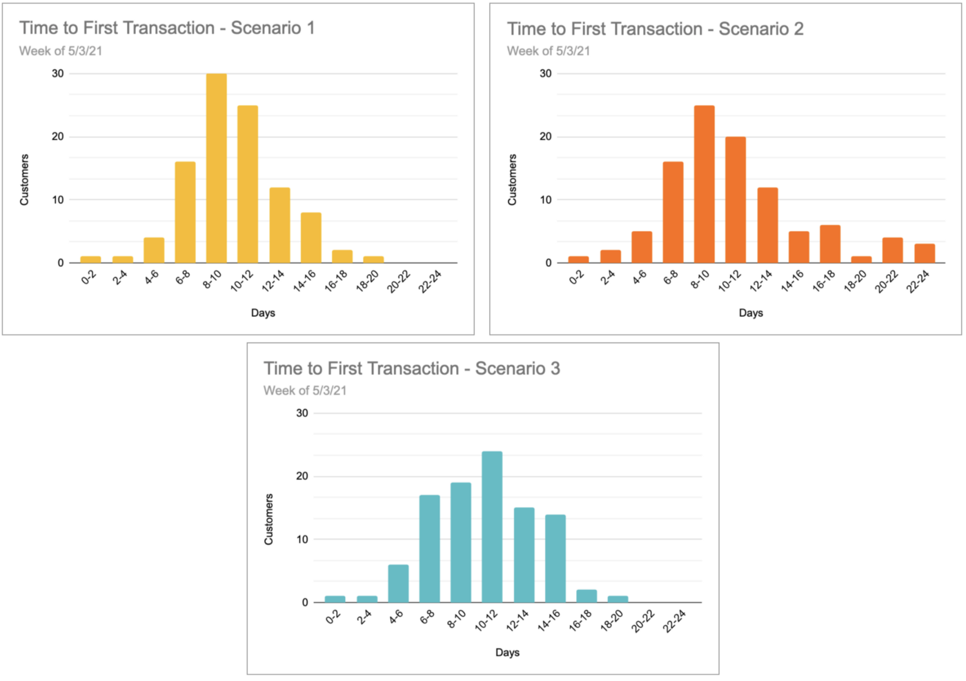
While these are just three examples, they illustrate the multitude of potential complications when a distributional metric doesn’t have the right resolution of visibility applied.
So what can we do about this?
Before we get too much into doom and gloom, know that you do have options when it comes to getting a better handle on your key distributional metrics! Here are some recommendations based on past experiences on managing these types of metrics:
- Track several distribution summaries. Averages aren’t all bad and can still be used effectively, but they aren’t enough. Consider using medians (for a more stable measure of the “typical” experience) and outlier measures, such as 95th or 99th percentile (which represent the most extreme experiences in the distribution, but serve as early warnings)
- Don’t skip out on dimensional richness. Everything I’ve shared previously on dimensional richness is just as applicable with distributions. The right dimensions let you narrow down distributions to more targeted groups, which make it easier to spot troublesome or unexpected behavior
- Utilize histograms. Adding a histogram into your metrics review provides a huge boost in contextual insight for teams. These are relatively straightforward to build, and while a bit time consuming to maintain manually, the investment usually pays off.
- Bring operational visibility to your distributions. Anomaly detection and alerting, trend discovery, and reporting should all be brought to bear on the full spectrum of your distributional metrics, just as you would on any other key metrics. This helps you get a handle on problems as they unfold in real-time.
Now, returning one last time to our time to transaction example, by following these steps, we would have improved our visibility into the bigger picture of the distribution:
- Tracking additional summary metrics and slicing by actionable dimensions (such as source channel) would mean that the affiliate promotion causing the big jump in time to transaction would be quickly identified
- Histograms would quickly show the larger shifts between time to transaction between mobile web and app customers
- Active monitoring would have alerted us to the specific dimensions and portions of the distributions that had changed in real-time, so that business reviews can be about planning out a strategy rather than attempting to understand what’s going on with the metrics.
At Falkon, we see distributions as some of the most important, and challenging, metrics for teams to harness, and our platform helps teams bring their distributions to life. Some of the most common average metrics we see which should instead be thought of as distributional metrics include: session duration, delivery time, time to first transaction, transaction value, deal size, time to support ticket resolution, cart size, and order flow duration, to name a few.
By following these steps, you can make significant inroads towards better incorporating distributions into your operational monitoring and decision-making. This enhanced visibility will empower your organization to move more quickly in addressing emerging problems and capitalizing on new opportunities.
Want more articles like this? Follow Falkon on LinkedIn.